Fellowship
As part of my BrainStation Capstone Project, I took on the challenge of identifying, researching, and designing a digital mobile solution for a problem space of my choice.
Given my passion for D&D, I set my sights on improving how players connect and find games. With adventure and camaraderie at the heart of the experience, I knew it would be an opportunity to really focus on human-centered design.
Role: Researcher, UX/UI Designer, Writer, Branding
Tools: Figma
Timeline: 10 Weeks
Platform: IOS
Research
Methods: Secondary Research, User Interviews
Dungeons & Dragons isn’t just a game—it’s a cultural force. With seven straight years of sales growth and a record-breaking 2020, the player base is bigger than ever. But there’s a catch: finding a group to play with can be a quest of its own, especially for newcomers.
Every week, countless posts flood D&D forums and subreddits, racking up thousands of likes from players struggling to find games. While online communities thrive on platforms like Discord and Reddit, they’re often fragmented, exclusive, and difficult to navigate—leaving many players on the outside looking in.
Opportunity Selection
Task Selection
Using the opportunities identified within the experience map, I generated 30 user stories so I could define the core functionality of my solution.
After that, I organized them into epics and selected one that had the most compelling narrative that responded to my challenge of “ensuring that potential new members meet that group's preferences”


In terms of impact, Fellowship is a solution that resonates with D&D players. It is an product they feel would elevate the game-finding experience, and result in more confidence when choosing a group.
When it comes to future thinking, there are a few things that stand out:
Monetization - What is the main profit generator in Fellowship?
Engagement - How do I keep DMs and Players engaged?
How I have envisioned Fellowship operating is with users paying a monthly subscription fee, with there being community events/seasonal themes keeping things fresh and users engaged.
Key Learnings
Epic 2 – User Profiles & Rating System
This epic directly ensures that players connect easily while verifying compatibility with a group’s preferences before joining. It provides transparency, trust, and accountability, making it easier for stable groups to form. By implementing user profiles, preferences, ratings, and reviews, players can make informed decisions about who to play with.
Based on this key epic, I created a task flow diagram, with the central story being that our user is trying to find a game that they know will meet their preferences so that they can ensure their game is high quality.
Ideation
I started by compiling a UI inspiration board to get an idea of how the elements and screens within my task flow are usually done. By gaining an understanding of the different ways the elements and screens can be designed, I was ready to move on to some exploratory sketches.
The exploratory sketches were a way to quickly explore different ways of designing the solution screens and not limit myself to my initial idea.
I conducted usability testing on these wireframes, in an attempt to define points of failure or where users may struggle. I came away with a design improvement matrix that I could use as a guideline to fix user frustrations.
Through two rounds of usability testing, this is the final prototype settled on, ready to be turned into a high fidelity mockup.
High Fidelity

UI Library
Marketing Website
Design Impact & Future Thinking

How might we design a solution in which players can connect to each others in an easy way, while ensuring that potential new members meet that groups preferences to ensure that cohesive, fun groups are formed?
I developed an experience map to outline the experience of our persona looking for players in a game he is running. Through this process, I discovered several opportunities for solutions:
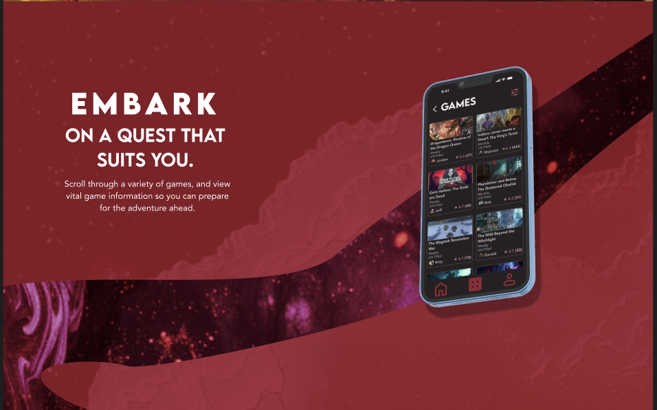
Limit search results through filters
Search for players or games to join
Dedicated platform for forming games
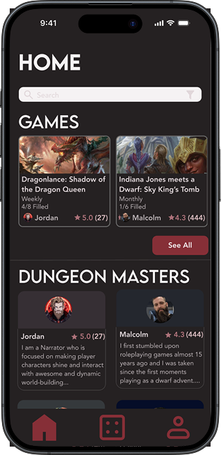
User profiles displaying preferences
Star ratings by others, telling you player quality
Game call room, displaying time started and expected length.
With the sketches defined, it was time to move on to wireframing. Before I dove straight into design, I defined my greyscale values and typefaces in Lemon Milk and Avenir.
I finally prototyped the whole task flow of searching for a game, verifying who is running it through reviews, and finally joining and playing a game, through my mid-fi wireframes.


Visual Identity


-
I started off by developing a list of adjectives I wanted the brand to employ: Playful, Fantastical, Adventurous, Inclusive, Boundless, and Heroic
-
I generated a list of names and landed on Fellowship.
This name evoked the fantastical, adventurous, inclusive, and boundless sense I wanted the app to evoke.
It is also a clear reference to Tolkien, and the titular team of heroes formed in The Lord of the Rings. Users will have a sense of adventure and bringing together a group of friends to go on a grand journey, which is what D&D is all about.
-
I put together a moodboard, keying in on the adjectives I chose earlier, and from those extracting a variety of colours. I put those colours into groups, and from those groups, chose one main brand colour, with two additional neutral colours.

I put together a UI Library, carrying the specifications and dimensions of all the visual elements within Fellowship, giving myself and future designers a reference when coming back to the design.
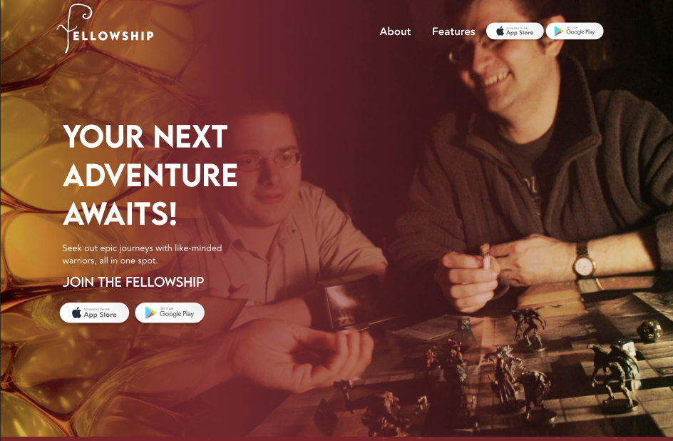
I designed a desktop and mobile website to market Fellowship, paying special attention to responsive design.
Key Considerations:
Brand Identity
Persona
Eye-catching design

-
The UX process was born from years of knowledge and experience of UX designers. They know what they’re talking about. It works, when you do it properly.
-
It is important to be thorough with ideation. A rushed ideation process means you start the prototype with a less established mindset, which can lead to the scope creeping and taking longer than expected.
-
The best way to learn and become better at UX, and the tools you use, is by simply doing it more. Experimenting and messing around leads to growth. Press buttons that you don’t know the function of, play around with settings you do not understand. It will help you figure things out, and CTRL+Z is your best friend.
My solution? A dedicated mobile platform designed for D&D players, by a D&D fan. Instead of repurposing generic tools, this app will give players an easy way to showcase who they are, find open games, and connect with like-minded adventurers.